In preparation for TotalCon, I spent this morning doing a little prop-making for the horror game I’m running. I’ve actually been planning this for a while so today was just about execution. I haven’t posted about it so as not to spoil anything for my players who are likely reading this, but I realized I could post some general prop-making things without giving away much about the game.
The first concerns handwriting. The module includes a couple notes written by different people that can be found as clues. While the text seems to expect the GM will simply read the contents out to the players, I think this is a clear case where a physical prop is more interesting. The problem then is, how do I create hand-written notes that were allegedly written by different people that don’t all just look like my own hand writing? Also, equally important – how do I do so in a way that they’re still legible by my players?
There are a couple ways to do this. You can find a pretty wide range of free handwriting styled fonts online, so you can write something using one of those and print it out. Just be careful – some fonts at smaller sizes, and some at any size, are just illegible to the average gamer. Nothing quite spoils the mood like an illegible hand-out.
Another option is to conscript a friend to do some of the writing, that way the handwriting is different. Me, I opted for the hardest approach – change my own handwriting. Here’s a quick bit of practice sample text I wrote in three styles:
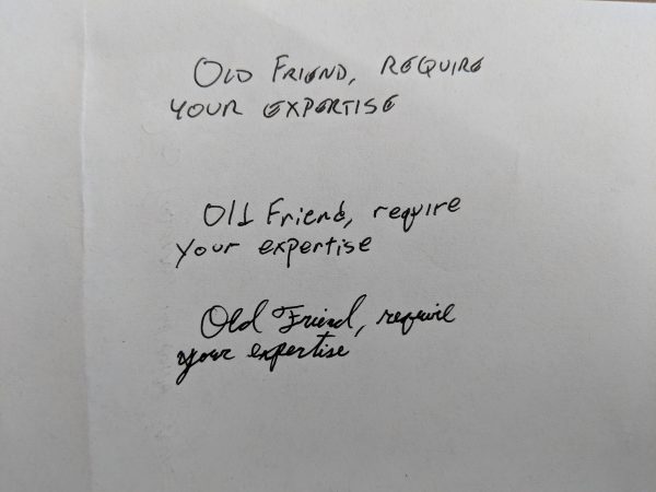
The top line is my normal handwriting. I actually remember inventing this when I was in the 8th grade. I didn’t like how my handwriting looked so I experimented with a mini-caps print style and I liked it so I kept using it. Now it’s just how I write and what comes naturally, everything else requires concentration.
The second line is me forcing myself to use real lower-case letters. It slows me down a lot, but frankly that’s a good thing for writing hand-outs that I want to be legible to my players. In this case you can see I went too fast and ended up accidentally making a cursive q for some reason in the word “require”.
The third line is cursive, which also requires me to go slow and think about what I’m writing. Pretty funny for a handwriting style that’s supposed to speed you up, right? But I never use cursive except for my signature, so it doesn’t come naturally. Again you can see I went too fast and started making a non-cursive y in the word “your” before I corrected it.
For Bryson Springs I needed two styles, so I went with the latter two. I think they look pretty different, and both require me to concentrate and go slow which ultimately helps overall legibility. I use a Bic Uniball pen which has a nice ink-flow, similar to a fountain pen, but without the accidental blotches a real fountain pen would create. I like that the end result still looks kind of fountain-pen like, and less like it was written with a modern ball-point pen.
The other big project this morning was blood. Specifically I had a prop that was supposed to be blood splattered. So I went out to Target yesterday and bought myself these two bottles of red acrylic paint:
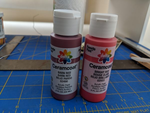
Which looks more like blood? Definitely the darker “Barn Red”. I experimented on some paper with both paints, as well as mixing the two, but the best result was the “Barn Red” right out of the bottle. I thinned it with just a little water, soaked it up with the largest brush I had on hand (which was still pretty small – most of my painting is for miniatures), and flung it at the prop. Here’s the result:
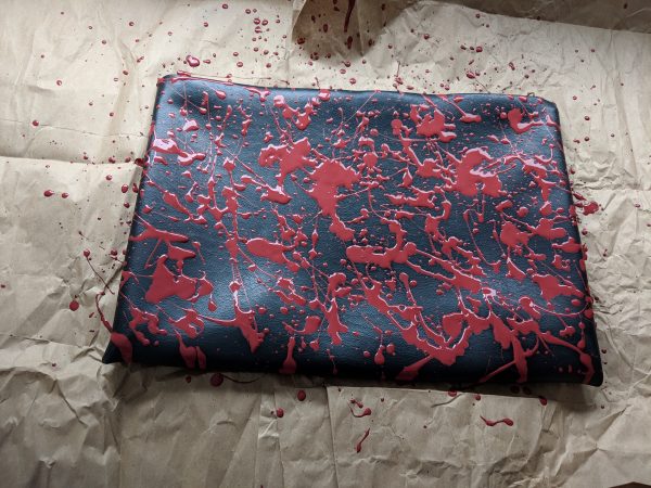
I think it looks pretty good, we’ll see if it’s still good once it dries. I’m also pretty impressed with myself for not getting any of the paint on myself or the surrounding furniture.
Well, that’s all I have from this morning that’s not completely spoiler-ridden. Yeah, the blood thing is maybe a tad spoilery, but come on, it’s a horror game. How could you not expect blood? I will post more details of my prop-making, and results on how they were received, after TotalCon.

